Claris Studio is a new tool that makes your data easily accessible from the web. There are multiple ways to view data in Studio; in this article, we will be discussing Dashboards. Dashboards provide a visual representation of your company's data. Users can quickly build graphical displays to view relevant information.
To follow along, you'll need access to Claris Studio and the data file at the end of this article (our thanks to Debra Dalgleish at Contextures for the excellent sample data).
Studio Dashboards are based on Spreadsheets. Before we can begin working with dashboards, we need a Spreadsheet with data in it. We'll start by creating a Spreadsheet with sample data. If you already have a Spreadsheet in Studio you'd like to use, skip ahead to Create a Dashboard.
Create a Spreadsheet
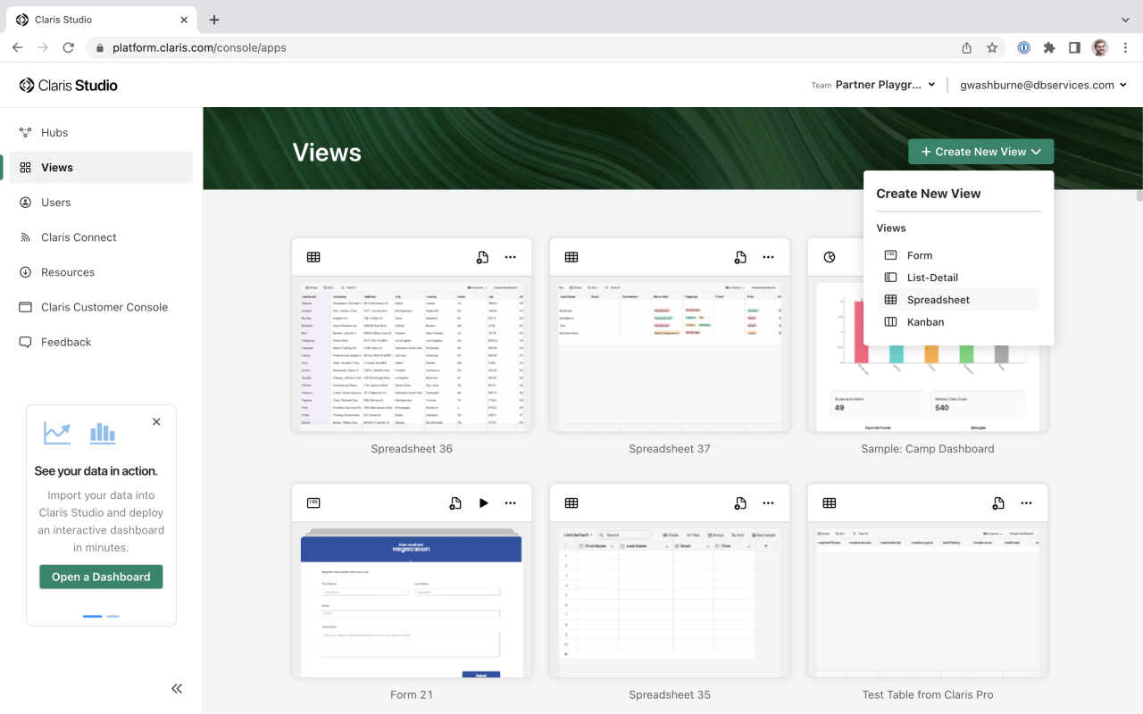
Sign in to Claris Studio and go to the Views page. Create a new Spreadsheet by clicking the Create New View button and selecting Spreadsheet.
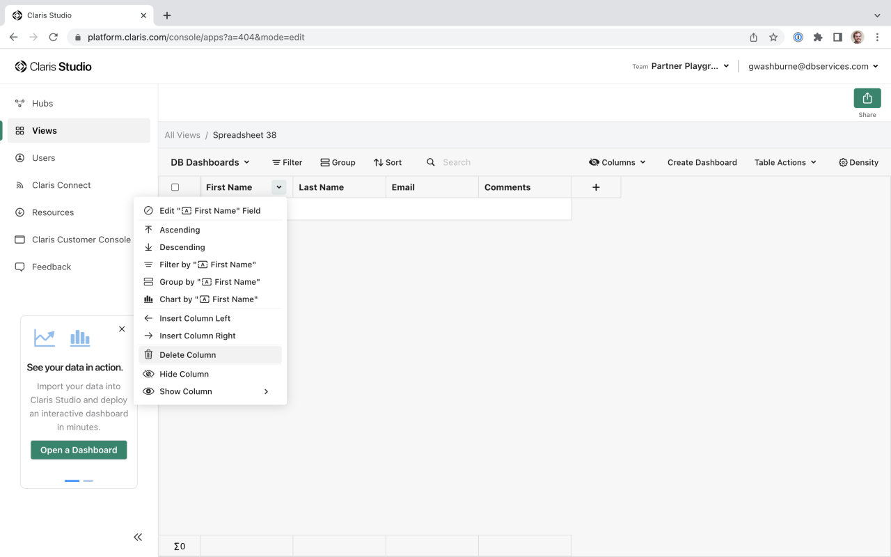
Studio will create a blank Spreadsheet with a couple default columns. Click the table name to give your table a more descriptive name and delete the default columns.
Now you have a blank Spreadsheet that's ready for data!
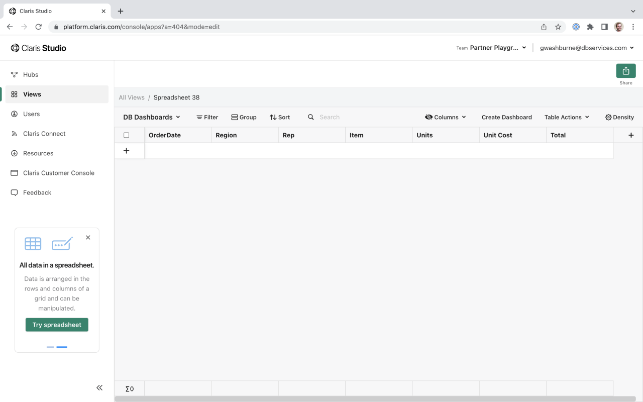
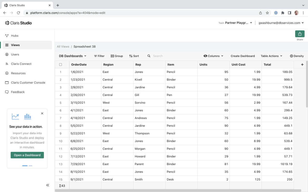
The sample data we are using has the following columns: OrderDate, Region, Rep, Item, Units, Unit Cost, and Total. Click the plus button to add a column. Select the appropriate Field Type for each column: Date for OrderDate; Short Text for Region, Rep, and Item; and Number for Units, Unit Cost, and Total. The empty Spreadsheet should look like this:
Now it's time to add data. You can import CSV files, add data from Claris Pro, or manually add data right in the Spreadsheet. We'll import a CSV file. Since we have the columns all set up, it's very easy to import our data. Click Table Actions > Import from CSV. If you haven't already, download the DB Dashboards Sample Data file at the end of this article and select this file to import. You'll be presented with a column-matching screen.
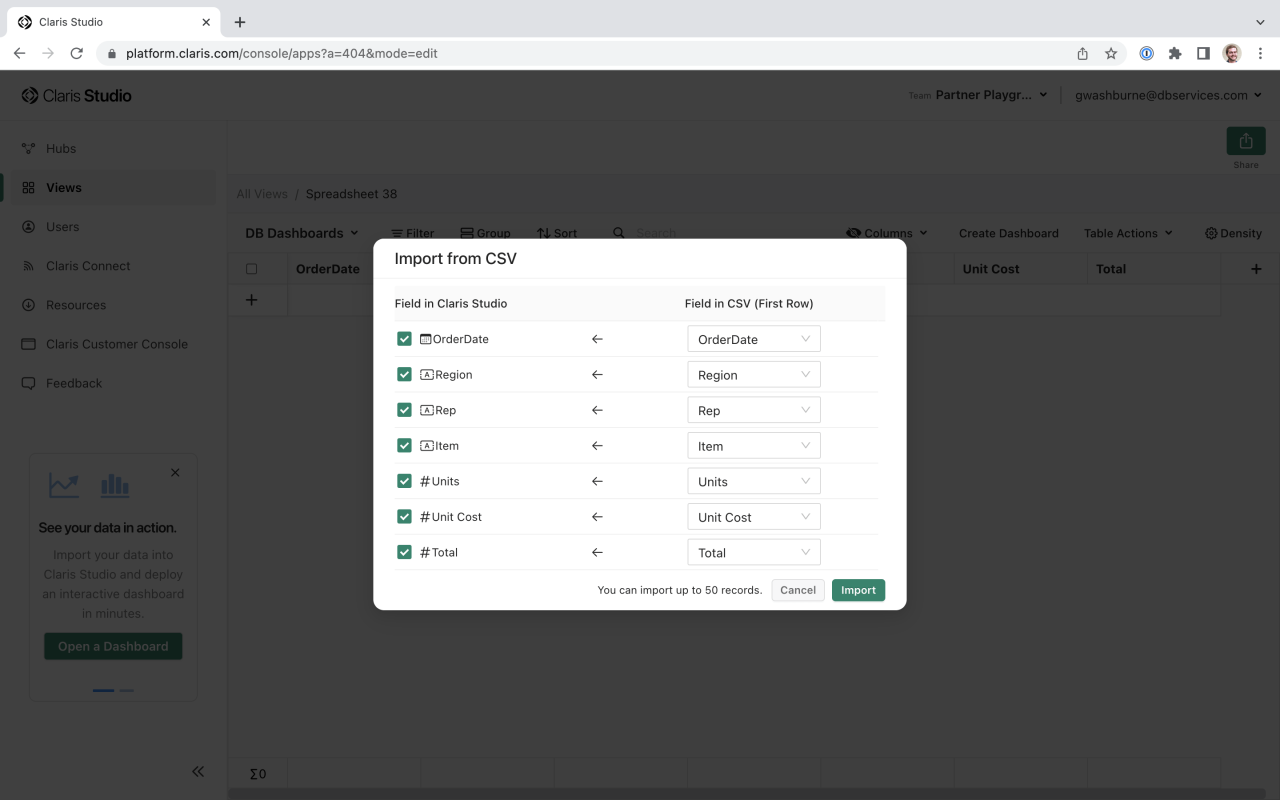
Because we gave the Spreadsheet columns the same name as the columns in the CSV file, they should match up. Verify this and click Import. Studio will import the data, and now our Spreadsheet is populated!
Create a Dashboard
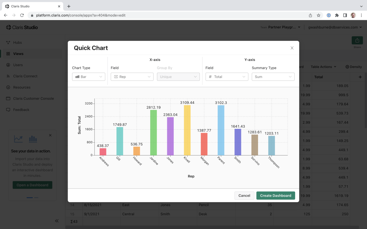
Now that we have a Spreadsheet with data, we can create a Dashboard! Click the Create Dashboard button located by Table Actions. A Quick Chart pop up will display. We can use this to create an initial chart for our dashboard. As an example, let's see how much our representatives have sold. Change the Chart Type to Bar and set the X-axis Field to Rep. Set the Y-axis Field to Total, and the Summary Type to Sum. Now we can easily see which representatives have sold the most.
Click Create Dashboard. Studio will create a dashboard with the chart we just created.

Dashboards are made up of different objects. These objects can be Charts, Summaries, Images, and more.
Dashboards employ many of the same controls that the other Views in Studio do. You can rearrange objects on a Dashboard by clicking and dragging. Click the Dashboard title to change it to something more descriptive. To change the header or an object's settings, click the gear icon for that object. To delete an object, click the circle with three dots and select Delete.
It's important to note that Dashboards are just a window into your data. If you need to add more data or edit existing data, that will have to be done in Claris Pro or the Spreadsheet. However, after you make your edits, your Dashboard will automatically update with the new data (you'll need to refresh the window if you have the Dashboard currently open).
Customize Your Dashboard
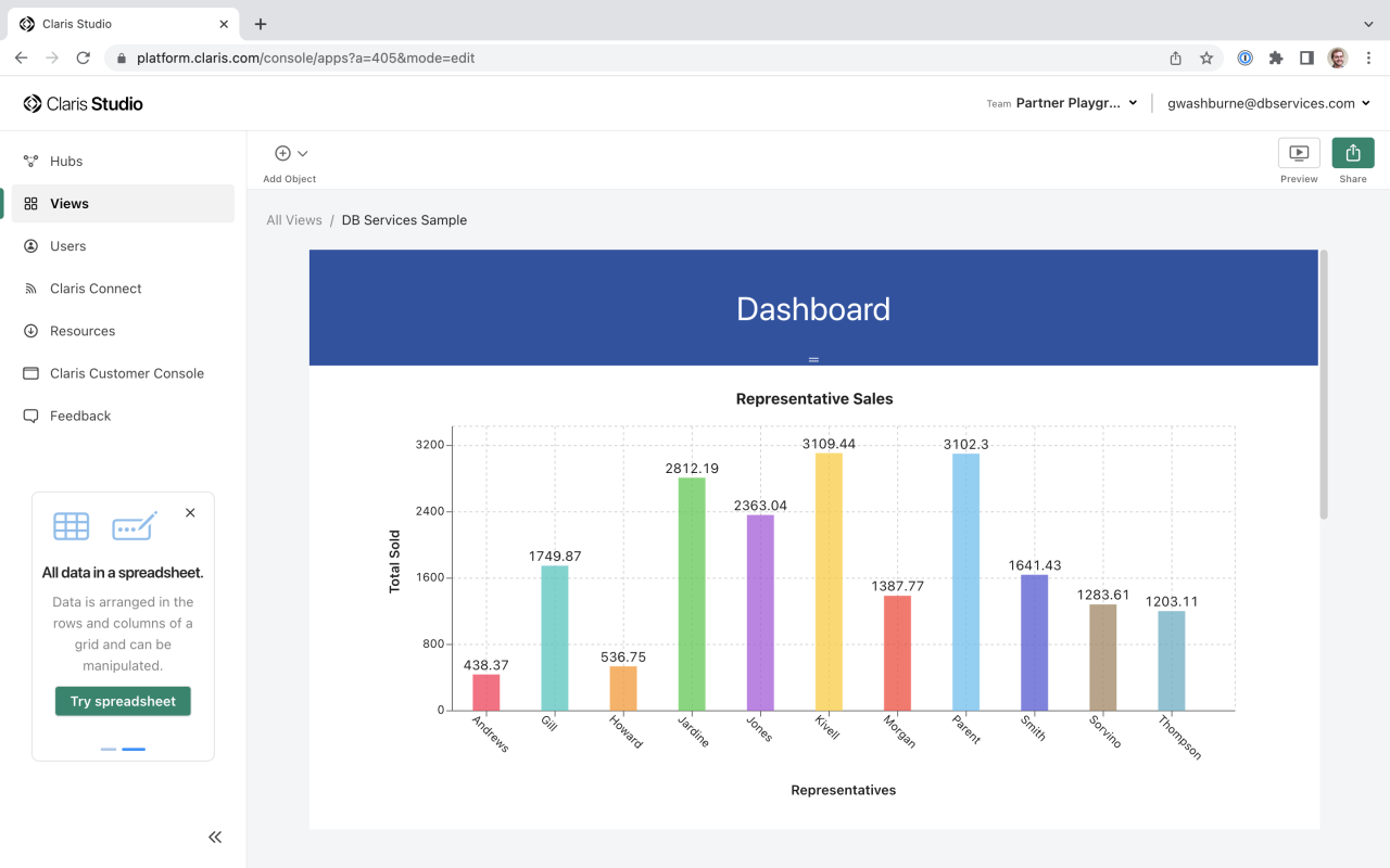
Let's customize our Dashboard. Mouse over the chart we just created and click the gear icon in the upper right. You can change the source table, Y and X axis names, and more. Go ahead and change the axis names to something more descriptive. Click out of the settings popup. The chart will refresh and the new names will appear. You can change the chart name by clicking the "Enter Chart Title" text at the top of the chart. Now our chart is easier to read and understand:
To add more data to the Dashboard, we need to add more objects. In the upper left, you can select "Add Object." You can drag objects out of this menu and place them on the screen. Additionally, you can click next to the border of an existing object. Mouse over the border, and a green line will appear with a plus icon. Clicking this will display the Add Object menu:
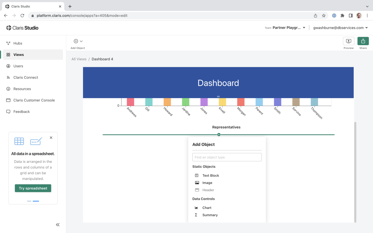
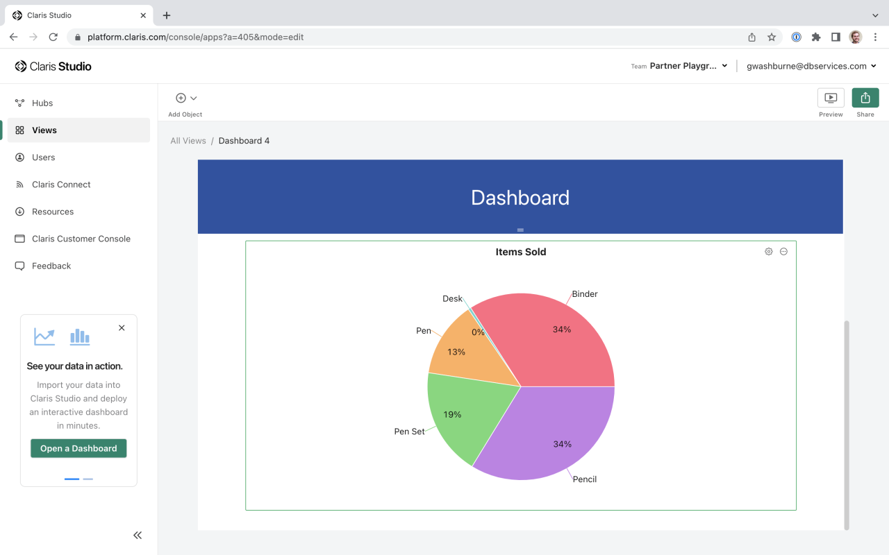
We'll add another chart. Once you click the Chart option, Studio will add another chart to the screen. Odds are, the fields that Studio picked are not the ones you want to display. Click the gear icon and adjust the chart. We'll create a Pie Chart to show which products have been ordered the most. Set the X-axis to Item and the Y-axis to Units, with the Summary Type set to Sum. We don't need to display a label for the X-axis, so enter a space in the name field. This will hide the default name, which is the data source field name. Change the chart name, and we now have a good-looking pie chart located under our bar chart:
Now, let's play around a little with what else Dashboards have to offer. Add a Summary object under the pie chart. Summary objects give us another insight into our data; we'll add one to show information for one of our sales reps. In this case, the newly created Summary displays the record count for the table:
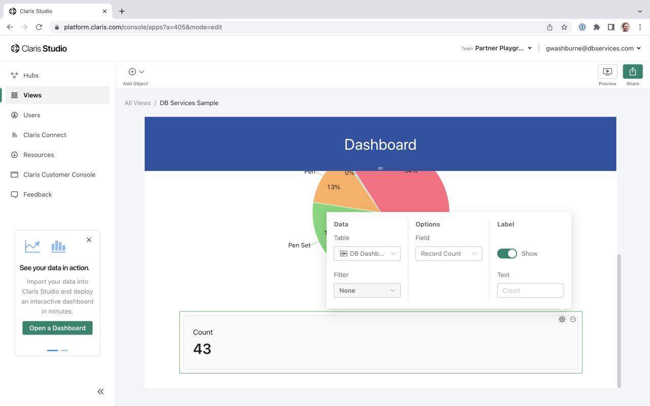
We'll change this slightly to show the record count for one sales rep, which will tell us how many orders they have handled. Click the gear icon for the Summary, click the Filter field, and add a condition. Adjust the parameters so that it reads "Rep is equal to Kivell."

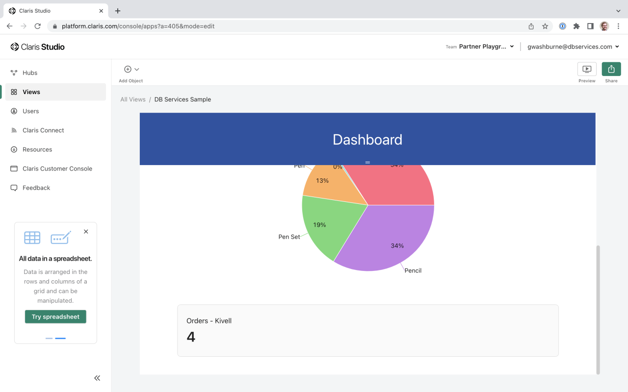
Click out of the pop ups. Now our Summary field will display the total orders for Kivell. Change the Summary name by clicking the gear icon, changing the label text, and clicking back out. The Summary now is properly titled and showing the correct information:
You can continue to add different objects to customize your dashboard. We've also created a sample dashboard for you to explore, similar to the one we just created. Additional objects have been added to give you a feel for the capabilities of Studio Dashboards.
Claris Studio Dashboards is a new and exciting way for users to view the information they need to see. Separate Dashboards can be created for each user's unique needs, enabling them to quickly access relevant data. If you have questions regarding Claris Studio Dashboards and how they can help your company, or if you would like to get access to Claris Studio, contact DB Services - we're here to help!
Did you know we are an authorized reseller for Claris Licensing?
Contact us to discuss upgrading your Claris software.
Download the Claris Studio Dashboards: Sample Data File
Please complete the form below to download your FREE FileMaker file.